All work
[ Case study ] [ Product design ] [ Mobile app ] [ 2024 ]

Mindful
Finance

A personal-finance app for millennials that pairs bills and budgets with mindfulness tools, built on one research finding: the apps meant to help were adding to the stress.

Role
Product designer: research, UX, UI
Timeline
6 weeks (3 in research)
Platform
iOS
Tools
Figma, Google Forms
Explore the screens

Personas are composites built from survey responses. Quotes are real. Names and photos are not.

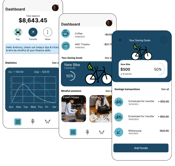
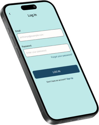
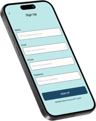
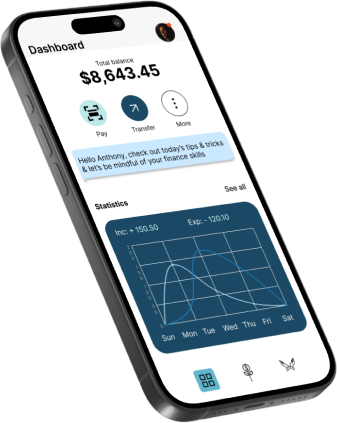
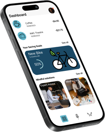
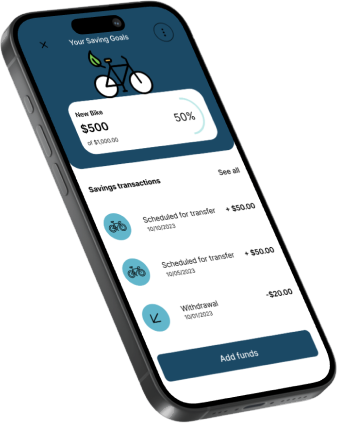
Dashboard screen: total balance, Pay and Transfer actions, a greeting with today's tip, and a weekly income versus expense chart Dashboard with recent transactions, a New Bike savings goal at 50%, and mindful solutions cards Savings goal detail: New Bike, $500 of $1,000, scheduled transfers and an Add funds button
01 · [ The brief ]

Money apps were part of the problem

Millennials trust the apps. The apps don't return the favour.

The brief was to understand how millennials feel about the finance apps and services they use, how much they trust them, what features they want, and where the experience could improve. The goal that followed: understand what they need to have a good experience with Mindful Finance, and design a product that fits.

Four tensions came out of the first conversations and stayed with the project to the end.

  1. A

    Navigation

    People value the tools and still get lost in them. Too much on every screen.

  2. B

    Overuse

    Checking the app became a habit, and the habit was making people anxious.

  3. C

    Control

    Customisation and moderation mattered more than any single feature.

  4. D

    Pressure

    Student debt and a hard job market shape how 25 to 35 year olds feel about every number.

Millennials value fintech apps, and struggle to navigate them. Heavy app use was hurting the very thing the apps promised: peace of mind.

Problem

Millennials need a solution that addresses their challenges with financial-technology apps, specifically managing bills and finances, while promoting mental health and well-being by addressing financial freedom and the negative effects of excessive app use.

Solution

Develop a product that lets millennials manage their bills and upcoming expenses, and connects them with like-minded people saving toward financial freedom.

02 · [ Research ]

Listening first

Research goals

Before designing anything, I wanted to know how millennials actually pay bills and manage money today, and where it hurts.

  1. Understand the current methods millennials use to pay bills and manage their finances
  2. Identify the pain points and challenges they face with those methods
  3. Determine how they feel about finance apps and services, and how much they trust them
  4. Understand their preferences for features and functionality
  5. Identify opportunities to improve their experience

Who I studied

Millennials aged 25 to 35 who are responsible for paying bills and managing their own accounts. Digitally savvy by default, but often carrying student debt and navigating a difficult job market, which shapes both how they use money apps and how they feel about them.

0Survey questions
0Weeks of research
0Personas
0Key findings

The project ran over six weeks. The first three were spent conducting user interviews, gathering survey responses from millennials and analysing the data.

The 18-question survey was built in Google Forms and released on social media; interviews were conducted over the phone with young professionals across all walks of life. Mindful Finance has no direct competitor, so I reviewed adjacent apps to understand industry standards.

Once data collection was complete, I affinity-mapped the results into key findings, then built personas from those insights.

Key findings

  1. 1

    Millennials value financial-technology apps for managing their finances, but face challenges navigating these tools.

  2. 2

    Excessive use of project-management and task apps can have negative effects on millennials' mental health and well-being.

  3. 3

    Customisation and moderation are crucial factors for millennials when using these apps.

  4. 4

    Young professionals aged 25 to 35, burdened by student debt and a difficult job market, represent the target demographic.

Personas

Sarah

32 · Travel & hospitality manager · London, UK

Problem-solver
"We must optimise our processes, implement new systems, learn to adapt. It's worth the effort in the end."

Highly organised and deadline-efficient, Sarah runs a travel agency and pays close attention to every aspect of her career. Customer-service driven and resilient.

Goals
  • Expand her agency's clientele and increase revenue
  • Give clients unforgettable experiences
  • Stay up to date with travel trends
Frustrations
  • Managing her business and personal accounts
  • Maintaining profitability

Nick

28 · Finance · Atlanta, GA

Analytical
"I'm here to establish genuine savings, with a fun interaction that keeps my savings growing."

Nick has a keen eye for numbers and enjoys working with data. As a single father he's driven to provide for his child and build savings for a better future.

Goals
  • Climb the corporate ladder
  • Build long-term financial freedom
  • Keep a healthy balance between work and home
Frustrations
  • Managing large amounts of data
  • Facing difficult financial decisions
03 · [ Principles ]

Four rules the app follows

  1. 01

    Show less money.

    The dashboard leads with one number and two actions. Detail is a tap away, never on the first screen. Finding one said people got lost; the fix is fewer places to get lost in.

  2. 02

    Moderation is a feature.

    Built-in breaks and a Mindful tab exist because the research said the apps themselves were the stressor. An app that wants less of your attention has to design for it.

  3. 03

    Customise, don't configure.

    Work-life settings are set once, in plain language, then get out of the way. Control was the thing people asked for; a settings maze is not control.

  4. 04

    Progress you can feel.

    Rings, percentages and months-left instead of raw ledgers. A goal that reads "$500 of $1,000, 3 months left" is a sentence, not a spreadsheet.

04 · [ Solution ]

Money, with breaks

Mindful Finance promotes mental health by emphasising moderation and balance in how the app is used: customisable work-life settings, mindfulness prompts, and progress tracking with built-in breaks.

The MVP focuses on the intersection of the two research threads: people wanted their finances handled, but not at the cost of their attention. Every feature below either reduces the number of decisions a user has to make, or gives them a reason to put the phone down.

  1. 01

    Customisable work-life balance settings

    Personalised preferences for work hours, breaks and notifications to keep a healthy balance between work and personal life.

  2. 02

    Mindful prompts

    Mindfulness prompts, reminders and short exercises that support users' mental well-being.

  3. 03

    Progress tracking

    Track progress on goals and tasks to monitor productivity and spot areas to improve.

  4. 04

    Built-in breaks

    Scheduled intervals for rest and relaxation, encouraging users to step away regularly.

  5. 05

    Financial management

    Bill-payment reminders, expense tracking and budgeting tools to manage money effectively.

Every feature answers a finding

FeatureResearch finding it answersPersona who asked for itWhere it lives
Work-life settings3 · Customisation and moderation are crucialSarah, separating business from personalSettings, set once at onboarding
Mindful prompts2 · Excessive app use hurts well-beingNick, "a fun interaction that keeps my savings growing"Dashboard reminder card, Mindful tab
Progress tracking1 · Value the apps, struggle to navigate themNick, who likes working with dataDashboard statistics, savings-goal ring
Built-in breaks2 · Excessive app use hurts well-beingBothMindful tab: Start your day, Healthy habits
Financial management1 · Value the apps, struggle to navigate themSarah, managing two accountsFinance tab: cards, transactions, bills
05 · [ Structure ]

How it's organised

Site map

Seven branches, three of which the user sees every day: Dashboard, Finance and Mindfulness. Onboarding is kept to a welcome, a login and a short tutorial so first-time users reach the dashboard fast. Community was mapped but never built.

Onboarding
  • Welcome message
  • Home screen
  • User login / registration
  • Onboarding tutorial
Dashboard
  • Financial status
  • Goal tracking
  • Work / life balance
Finance
  • Expense management
    • Budgeting tools
    • Expense tracking
    • Bill tracking & reminders
  • Financial goals
    • Goal setting & tracking
    • Debt management & repayment assistance
    • Savings & investment tracking
Mindfulness
  • Mindfulness prompts & reminders
  • Built-in breaks & relaxation exercises
  • Mindfulness resources & techniques
Community not in MVP
  • Social community & peer support
  • Forums & discussions
  • Sharing experiences & advice
  • Friends
    • Friend requests
    • Friends list
    • Details
Settings
  • User preferences
  • Security & privacy
  • App notifications & reminders
Integration
  • Linking bank & financial accounts
  • Notifications for unusual spending
  • Other financial tools & services

User flow: setting a budget

The core task: from Home, into Finance, add an expense, categorise it, set a budget and confirm, with review and reminder steps before the task completes.

Mindful Finance user flow: setting a budget From the entry point the user lands on Home, selects Finance from the tab bar, opens Expense management, adds a new expense and sets its amount, then returns to Expense management. From there they scroll through expenses, add or categorise an expense, set a budget, review reminder and tracking features, review or adjust the budget, save changes, see a confirmation, and the task is complete. ENTRY POINT HOME SELECT "FINANCE"from the tab bar EXPENSEMANAGEMENT ADD NEW EXPENSE SET AMOUNT EXPENSEMANAGEMENT SCROLL THROUGHEXPENSES ADD / CATEGORISEEXPENSE SET A BUDGET REMINDER &TRACKING FEATURES REVIEW / ADJUSTBUDGET SAVE? CONFIRMATION TASK COMPLETE USER ACTION SCREEN DECISION
Two rows because the task has two halves: capture the expense, then shape the budget around it.
06 · [ Design ]

From grey boxes to calm

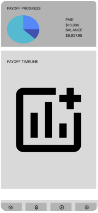
Low-fidelity wireframe of the payoff progress screen with a pie chart and a payoff timeline
Wireframe Payoff progress
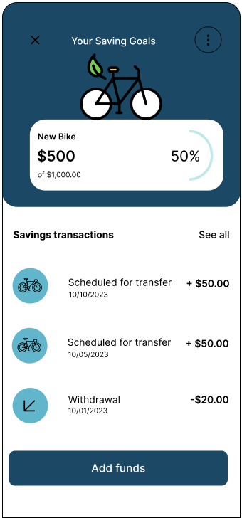
Final savings-goal screen: New Bike goal at 50% of $1,000, with scheduled transfers and an Add funds button
Final Savings goal

Style & branding

Minimal, clean and intuitive, using "therapy" colours: soft teals and blues chosen to lower the temperature of a money conversation. Inter for its neutral, legible voice at small sizes.

Aa
Typeface

Inter Google Fonts

StyleSizeLine height
Heading 132 px61.6 px
Heading 228 px52.8 px
Heading 324 px44 px
Heading 420 px35.2 px
Body16 px26.4 px
Palette
  • Primary#62B6CB
  • Navy#21445E
  • Sky#B1C8D7
  • Mint#A8C8C7
  • Text#2F2F2F
  • Surface#F5F5F5
Iconography Line icon set used in the app: music, grid, plant, hands, scan, transfer, coffee, ticket, bicycle, withdraw, journal and audio

How the app talks

The copy is part of the calm. Every line on the screens addresses the person by name, states one thing, and never turns a number into a judgement.

MomentSounds likeNever
Greeting"Hello, Anthony.""Welcome back, user."
Reminder"Friendly reminder. Don't forget to complete your daily check-in journal.""You have 1 incomplete task!"
Tip"Check out today's tips and tricks, and let's be mindful of your finance skills.""Your spending is up 12% this week."
Goal"New Bike. $500 of $1,000. 3 months left.""You are 50% behind schedule."
07 · [ Final product ]

The app, screen by screen

Pick a screen. Each one lists the decisions behind it and the research finding it answers.

Three overlapping dashboard screens: total balance with statistics chart, savings goals with mindful solutions, and the savings-goal detail
Dashboard

One number, two actions

    Answers finding 1 Designed for Nick
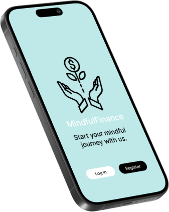
    Welcome screen: Mindful Finance logo, 'Start your mindful journey with us', Log in and Register buttons Log in screen with email and password fields Sign up screen with name, email, phone and password fields

    Onboarding: welcome, log in, sign up. Three screens, then the dashboard.

    08 · [ The unglamorous parts ]

    What the MVP doesn't answer yet

    09 · [ How I'd measure it ]

    Success is fewer sessions

    Most finance apps count opens. This one shouldn't. If the research is right, a good week is one where the user set a budget, checked in a few times, and otherwise left the app alone.

    I'd test with the two personas' tasks (set a budget, add a goal, complete a check-in, find a transaction) and track five numbers across the first month.

    Activation
    A budget or goal set in the first session. Target 60%.
    Check-in completion
    Daily check-ins completed per week. Target 4 of 7.
    Sessions per day
    Tracked so it goes down. More than three a day is a signal, not a win.
    Reminder opt-out
    Users who switch prompts off. Target under 10%; above that, the cadence is wrong.
    Goal completion
    Goals reached inside their stated months-left.
    10 · [ Reflection ]

    What I took away

    Researching and designing this product was challenging and rewarding. Listening to users, not just asking them, is what led to Mindful Finance.

    My favourite part was the wireframes: sketching how the app could look and behave once the research had given it a shape. The finding that changed the most was number two. I went in expecting to design a better budgeting app and came out designing one that asks you to use it less. That reframed every screen: fewer numbers on the dashboard, a section with no money in it at all, and reminders that suggest a break instead of a bill.

    The honest weakness was time. Six weeks wasn't enough to go through the survey data as carefully as I wanted, and the community features in the site map (peer accountability came up repeatedly in interviews) never made it into the MVP. Given another pass, that's where I'd start: deeper synthesis first, then prototype and test the community flows.